Example reading
PRODUCT DESIGN SYSTEM / 04NEW DELHI, INDIA2026
DELHI PULSE / CITY COMPANION
Your city.
At a glance.
Air. Movement. What’s next.
Your daily Delhi check, in one place.
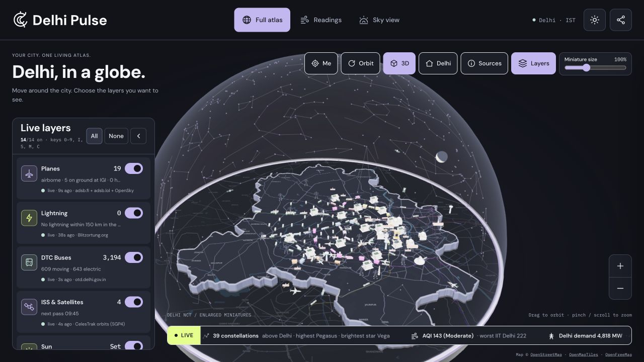
App capture · 30 September 2026 · OpenFreeMap / OpenStreetMap
Delhi Pulse brings the city’s air, movement, water and sky into view.
28.6139° N / 77.2090° E00 / THE IDEA
A clear view.
A distinct pulse.
A public window into Delhi, made for a quick daily check and a deeper look. Precise enough to trust. Familiar enough to return to.
Three references share bold sans-serif type, modular cards, compact navigation and deliberate colour. We combine the dating app’s confident contrast, Praktika’s lilac and lime accents, and Wayfinder’s quiet map with detailed miniatures. The geographic symbol makes the result Delhi Pulse.
01 / IDENTITY
Ring & River.
A compact city symbol.
A consistent name in every frame.
THE SYMBOL01.1

Concentric forms recall Connaught Place.
A flowing cut brings the Yamuna into the idea.
THE WORDMARK01.2

A bold, open wordmark. A precise, geographic symbol.
The symbol can stand alone; the name anchors shared screens.
 56 / 32 / 24 px
Give it room. Clear space: at least ¼ of the symbol’s width. Minimum symbol: 24px. Horizontal wordmark: 150px.
Keep it intact. Use the supplied vector assets. No stretched letters, heavy glow, shadows or multicolour logo.
Keep Delhi present. Keep the name, lilac signature and geographic symbol on screenshots and exports.
02 / COLOURClean canvas.
Clean canvas.
Confident accents.
Ink for hierarchy. White for space.
Lilac, lime, coral and mint for focus.
70 / NEUTRAL20 / INK10 / ACCENT
A composition guide for brand artwork. In the interface, readable text and source status come first.
READABILITY / CALCULATED
Contrast is part of the brand.
Every approved text pair passes AA for normal text. Figures use WCAG sRGB relative luminance. Colour is always paired with a label, shape or value.
Data keeps its own meaning: official Metro line colours stay official. AQI severity uses labelled semantic states; lilac and lime are brand accents, not pollution categories.
02.1 / DARK IDENTITY
Meet Midnight.
The same Ring & River identity.
A darker canvas, with the city still in view.

MIDNIGHT / #11131A
Same city.
New light.
Charcoal surfaces. Clear readings. Familiar lilac, lime, mint and coral. DM Sans and IBM Plex Mono keep their roles across both themes.
Open the atlas DELHI PULSE / COLOUR STUDY
Full atlasReadingsSky view
Example value
DM SANS / 700Your city, in view.
IBM PLEX MONO / 40028.6139° N
77.2090° E
77.2090° E
An identity specimen. These values are illustrative.
Eight working neutrals.
SELECT A SWATCH TO COPY ITS HEXThe signature stays.
Use ink #13151A on every bright accent. Keep accent colour deliberate; keep data severity labelled.
Readable after dark.
- Primary text / surface
- 15.11:1
- Secondary text / surface
- 8.08:1
- Ink / four accents
- 6.84–16.28:1
Solid text pairs calculated with WCAG sRGB luminance. Glass, map labels and rendered models need their own visual checks.
A shared visual language.
Keep the white Ring & River silhouette, original SVG icons, 12px panels and 8–10px controls. Use a lilac focus outline with visible separation. Illuminate the map and miniatures; preserve the transparent dome.
Use the theme button in the app header to try Midnight. Your theme choice persists while the camera and active layers stay in place.
03 / TYPOGRAPHYCity scale.
City scale.
Human reading.
Three roles.
A clear hierarchy.
01 / DM SANS700 / 800
Your city. At a glance.
Display · concise and confidentWeb 40–64 px / phone 32–44 px
02 / DM SANS400 / 500 / 600
The air nearby.
The way home.
Clear explanations, comfortable reading and familiar controls. Use sentence case for the interface.
Aa Bb Cc Dd Ee Ff Gg Hh Ii Jj
0123456789 & @ / + −
Body 16 px / controls 14 px / sources 12 px0123456789 & @ / + −
03 / IBM PLEX MONO400 / 500
28.6139° N
77.2090° E
77.2090° E
Coordinates, timestamps and changing readings. Fixed-width figures keep the interface steady.
120AQI 31°
MEASURED / 16:00 IST
Values 24–48 px / metadata 12 pxMEASURED / 16:00 IST
DM Sans provides the headings, interface and outlined wordmark. Plex Mono keeps changing readings steady. Fonts are self-hosted with their open licences. DM Sans ↗ · IBM Plex ↗
04 / VISUAL LANGUAGE
Sharp, with purpose.
Five repeatable details.
One recognizable product.
DP / 001
The colour block
A flat lilac or lime surface brings one useful reading forward. Ink text keeps the contrast clear.
+
Rings & river lines
The geographic symbol repeats across map pins, app icons and shared cards.
SOURCE CONNECTED OLDER READING
Signals with meaning
A simple dot identifies freshness. Its source state stays written beside it.
The city in miniature
Detailed landmarks and vehicles stand on a quiet geographic map. Roads and plain buildings provide context. Positions keep their source meaning.
Plain, precise icons
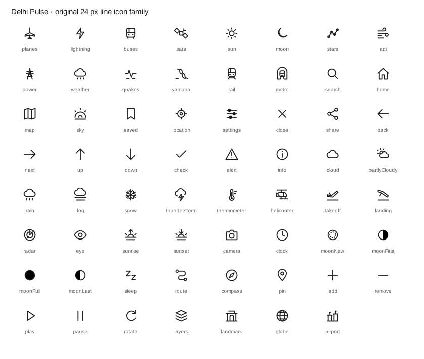
63 original SVG icons. One 24px grid, 1.6px strokes and a consistent tint. Android touch targets: 48px. View the icon family
Motion should reveal something.A 180ms state transition; a 600ms camera move; calm updates without flashing numbers. Respect reduced motion. Use motion for location, progress and selection.
05 / MOBILE & WEBOne atlas.
One atlas.
Every screen.
Desktop and mobile product captures.
30 September 2026.
WEB / FULL ATLASLIVE APP CAPTURE
One glass dome, a horizontal city floor and floating layer controls. Scroll into roads and buildings; return to the full city with the home control.
Captured 30 September 2026. Readings and available layers reflect that session; this image does not update.
MOBILE / FULL ATLASLIVE APP CAPTURE
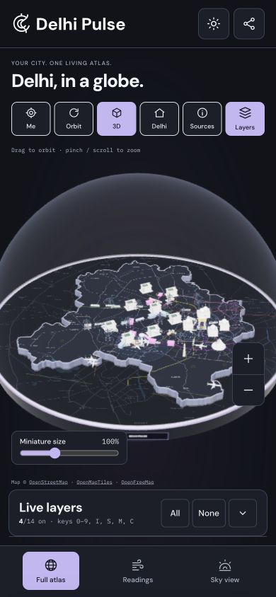
The same atlas on a smaller screen, with touch exploration, reachable layers and the same brand signature.
Captured 30 September 2026. A responsive browser capture; the native APK is not represented here.
The shared product signatureRing & River mark, DM Sans, deliberate lilac and lime accents, and Delhi inside a glass dome. Navigation stays Full atlas → Readings → Sky view across screen sizes.
06 / VOICE & TRUSTCurious. Clear.
Curious. Clear.
Grounded in Delhi.
Useful words.
Visible source meaning.
“The air nearby.”
Use everyday questions and short answers. Name the place. Explain why the number matters. Let the city carry the emotion.
- Welcome
- “Your Delhi, in view.”
- Explore
- “What’s moving above us?”
- Unavailable
- “No recent station reading.”
- Saved
- “The places you check.”
Every signal has a source.
● Measured◇ Modelled⌁ Estimated+ Calculated◷ Older reading
Show observation time, forecast validity or fetch time with the correct label. Keep station distance visible. A normal Metro advisory does not prove every train is running.
No mascot in the interface. Data is shown directly through readings, maps and charts.
01Primary wordmarkOutlined SVG ↗02Ring & River markSVG ↗03App / social iconSVG ↗04Brand poster1080 × 1350 SVG ↗05Design tokensCSS ↗06Design tokensJSON ↗07Brand rules & handoffMarkdown ↗08Miniature collectionSeven original GLBs / interactive gallery09Three.js assessmentTechnical handoff ↗10Full interactive atlasDelhi globe / fourteen layers ↗11Midnight identityDark palette & usage / Markdown ↗
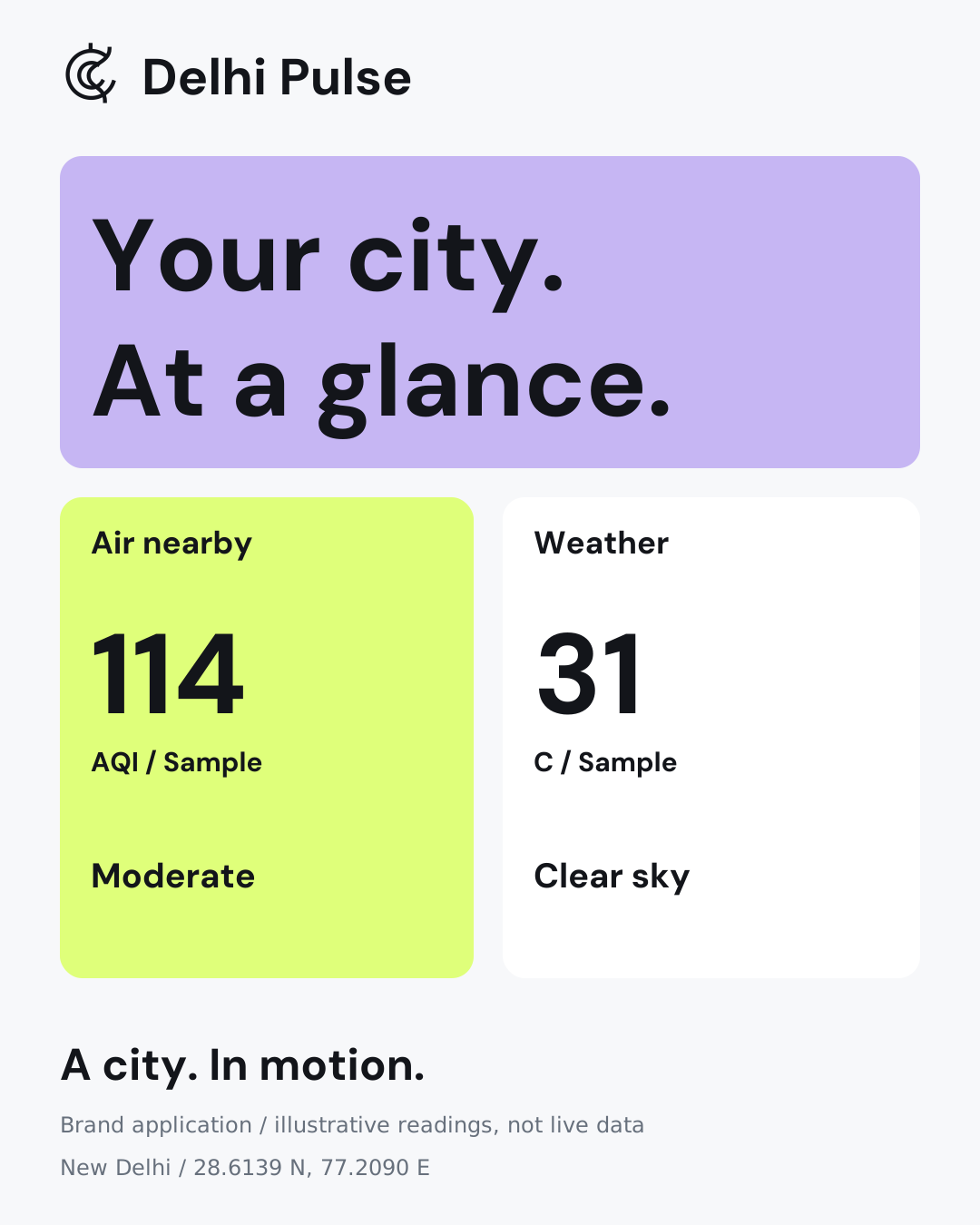
The kit includes logo variants, local fonts and licences, SVG icons, a poster, light/Midnight tokens, dark identity guidance and dated desktop/mobile app captures. The unified atlas keeps the fourteen original layers and data sources, with detailed miniatures inside a Delhi-only glass globe.